Top Ten Tuesday is hosted by The Broke and the Bookish!
I'm warning y'all now--this is going to be a lot of me being super picky. Like, for real. I will be nitpicking the crap out of these things.
I don't even care about the design. I personally have no ideas what to put on here. No, I'd keep the same design but instead of this random chick, I'd put on someone who ACTUALLY LOOKS LIKE THE MAIN CHARACTER. Or, heck, it doesn't even have to be the MC. It can be a supporting character. But it has to be someone in the book somewhere, otherwise this is pointless. So yeah, that's what I'd do.
I would change nothing about this cover except to go back to the beauty it was before the box.
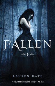
This whole series actually has gorgeous covers and I love them. BUT I want to go back to them all and chop her hair off. Her hair is supposed to be SHORT. She singed most of it before the first book even started and chopped off the remaining little, pathetic bit. It shouldn't be long.
Who is this character supposed to be? Seriously, I want to know. Because I've tried to figure it out for FOREVER now. I know No. 1 was Poppy. And No. 2 was Roshel. But I don't know who this is. Illiana? Because that's not how I picture her. The only character in this series I could see this one as would be Kestrel, and she was all the way back on Daughters of Darkness--No. 1. So I'd put a character on here that was actually recognizably in one of these books. Probably Keller, because she ended up with Galen and I heart him big time.
I'm actually not going to complain about anything here. I know some people hate the color scheme and that it's only Pepe and blah blah blah, but I'm cool with this one. I think this one is actually the most accurate of all the covers; it does a fantastic job of representing what's inside. No, I just want to redesign this so I can be the one to go through pictures of Pepe and whatnot to make the cover. That would be SUCH a hard job, but I'd be willing to do it. You know...for the sake of a great cover.
This is one of my favorite omnibuses. (Is that the plural for that? Hmm.) I get that it's plain because of the Amish subject and whatnot, but I wish it would be more eye-catching so more people would pick it up and love it as much as I do. Even though the ending pisses me off every time.
I don't want there to be people on these covers. It just does not work. I'd rather there were some symbol or something for something important in these. Because that is not Sydney and that sure as heck is NOT Adrian. Ha. No.
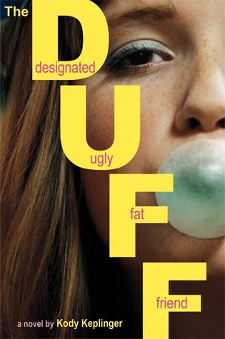
This book is fabulous! The cover not so much. That stupid gum irritates me so much. And the font...and...I don't like this at all. Bleh. I don't know what I'd do instead, but I can assure you it'd have not a thing to do with bubblegum, which is already and improvement.
By itself, I don't really have a problem with this cover. But when you set it next to the other books in the series, this one isn't as great. So I'd just like to work it up a bit to be on the same level as the rest.
It annoys me that there is an engagement ring on this cover. Because that implies that there will be happiness and togetherness and marriage and all that fun stuff. WAY OFF. This book is full of insecurity and arguments. Then there is making up and sweetness, but still--the ring isn't as important as this cover makes it seem. A ring doens't even come into play until LATE in the book. Like, laaaaaate. So I'd choose something else. A guitar, maybe. I don't know. Just not a ring.
So...what do ya think? Let me know! Did you make a list? Link me up!
♥Jessica(:


I want to help with the Pepe pictures!
ReplyDeleteFor the Night World, the lovely person on the cover is Iliana Harman:)
ReplyDelete